Listening longer to the Mandelbrot Set
2020-12-26 math composition
I've long been interested in ways to sonify fractals, and I wrote an article here about Listening to the Mandelbrot Set in 2017. At that time, I was thinking of it as a way to generate a waveform: basically, imagine running a point along the (infinitely wiggly!) boundary of the set, making many complete circuits per second, and use the real and imaginary coordinates of the moving point as waveforms for synthesis. Then the entire Mandelbrot Set (often abbreviated to "M") defines a timbre that may be interesting, and which can be used as a musical building block. It's a little bit like putting a phongraph needle on the edge of the set and playing it like a record.
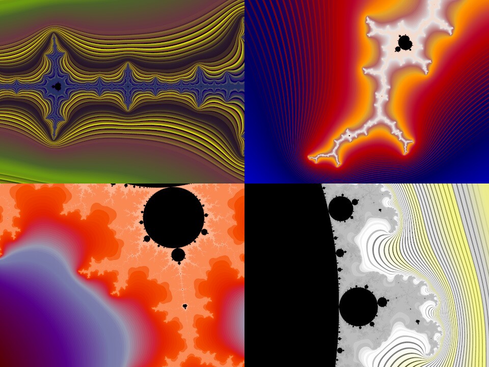
More recently I've thought about what might happen if instead of playing the entire boundary many times per second as a waveform, I stretched it out to cover an entire piece of music. The visual appearance of M is different in different parts of the complex plane, from the lightning-bolt-like antennae to the starfish valley and so on.

Of course, the different colours in my pictures also make them look different, but the shapes differ too. Maybe tracing the boundary would sound different in each region, so that over the course of the piece, as it visits each part of the boundary, the texture or feeling would change in a way that would be interesting to listen to. Having musical development or change over the course of a piece is often a problem in my sonification experiments, and this variation across different parts of M is something that wouldn't have been audible in the earlier project, scanning the whole thing many times per second.
Almost exactly a year ago I did some experiments with that, stretching the whole Mandelbrot boundary into a 10-minute piece of music. I had mixed results. One thing I quickly learned - which is predictable from the math, but I didn't figure it out until I listened to the sound files I was producing - was that there is basically nothing pitched in this signal. Nothing that sounds like a musical tone. That comes about because of the self-similarity of the Mandelbrot Set boundary. Little details look the same as big features; there is no single dominant size to the wiggles in the boundary in any region. As a result, there's no dominant frequency when we consider movement along the boundary as if it were a sound wave. So the audio from this exercise comes out sounding like bursts of noise, or at best percussion, not pitched notes.
I found I had to do a fair bit of processing to get something that would be worth listening to. The math by Douady and Hubbard proving the connectedness of M gives, as a side effect, a description of tracing the boundary in terms of a sum of sine waves; that's exactly what's needed to feed into a Fourier transform to get a sound wave. It blows my mind that we have that description when so much else about M is unknown and it looks so complicated; there's no reason obvious to me why it would be possible to compute this description at all, and yet, we have it. When I first started looking at sonifying M I thought I would have to do some kind of tracing, effectively just calculating lots of pictures of the boundary and following it around. Instead, there's a formula that can spit out a frequency-domain version of the whole thing in a single calculation.
But actually doing that calcluation takes a fair bit of computer time, perhaps unsurprisingly because the result is equivalent to a description of a finely zoomed-in curve hugging the entire complicated boundary. And with the description in hand, it wasn't something I could just feed directly to speakers and listen to. Most of the energy in the waveform is in very low frequencies, below audibility when the boundary is stretched to minutes in length. There is also more than a trivial amount of the signal in ultrasonic frequencies, which cause aliasing problems in digital systems and would be unpleasant for listeners even on equipment capable of reproducing them. I ended up doing a lot of filtering to get a spectrum that worked as audio. Bearing in mind that the math gave me a frequency-domain description, that was relatively easy: I could do the filtering by subtracting out coefficients for frequencies I didn't want, applying a curve to boost the ones I wanted more of, and so on, all before running it through an FFT to create the final audio.
There turned out to be a huge dynamic range in the signal: the quiet bits were very much quieter than the loud bits. If I just played it directly I'd end up with only a few loud bursts in the 10-minute piece, and effectively silence in between. So I applied a very heavy dynamic compression filter to the post-FFT signal to keep it at a more reasonable level throughout.
But there did seem to be something there: despite being unpitched, the signal had a very definite 4:4 musical rhythm through much of the playing time, and it had some (if not a lot) variation or development over time as well.
I learned more when I decided I wanted to combine the audio I was making, with video. I had the idea that it would be fun to watch a zoomed-in view of the Mandelbrot Set boundary that tracked the point currently playing in the audio track. Then, I hoped, any stylistic shifts in the audio would correspond to visual differences in the video. Maybe I could also accentuate them with human-chosen shifts in the colour scheme.
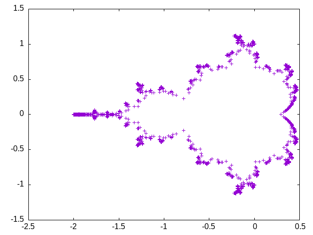
What I found on watching the first such videos was that the Mandelbrot Set boundary signal derived from the connectedness proof spends nearly all of its time out at the tips of the projections on the set. It swoops past the valleys and crevices quickly, spending almost no time there as a fraction of the total. But those are the most visually exciting parts of the set!
This plot illustrates what's going on. The points (representing a uniform selection of the frames in my video) are much denser out near the tips of the antennae. The video would spend almost all its time in those regions, only seldom and very quickly zipping past the interesting cracks and crevices.

That issue, computer processing limitations, and some problems I had with choosing good colours for the images, led me to basically shelve the project at the end of 2019. Then in 2020 I had a lot of other things to think about. But I upgraded my computer over the Summer, and in the last couple of months I've had some availability again to work on this project.
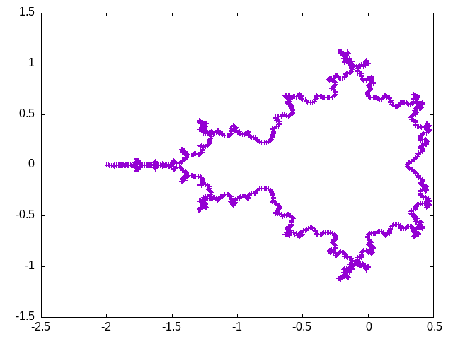
When I looked at it again I thought I might solve the skipping-over-valleys problem by essentially stretching time: compute a curve that hugged the boundary of M using a smoothed version of the boundary function (easy do to: just leave higher-frequency terms out of the FFT), then follow that curve at a constant velocity instead of one point at a time. Here's a plot of the frame coordinates I got from that procedure. In principle, it has no more plotted points than the plot above; but it looks like it gives much better coverage, because the points are spread out to be more or less an equal distance apart instead of concentrated all on top of each other in a few areas. Note that it still doesn't dip very deep into the valleys.

That was okay for choosing the coordinates of the frames in my video, but matching it up with the audio meant I had to stretch and warp the audio too. It took some trial and error to both get the time-warp working and to know that I had it working - because I had no known good reference to compare against.
The resulting video looked much nicer, but it didn't sound as good. The very musical 4:4 rhythm was lost; evidently, it was an effect of the same causes that were causing the video to swoop past the valleys, and eliminating those broke up the audio rhythm. I had to re-do all my filtering and compression settings to get it to be listenable at all. In many ways I liked the earlier version better. I ended up deciding to use both versions: the first half of the video uses coordinates and audio with time warp, and the second half without. That may make the whole thing more interesting anyway, since both versions were originally palindromes: the second half of either version is just equal to the first half played backwards, as a result of the symmetry of M along the real axis. Playing the first half of one and the second half of the other gets all the interesting parts of both into the same total time.
One final challenge had to do with choosing the colours for the frames. Mandelbrot Set images usually use a gradient of colour from the set itself in the middle (often coloured black) out to the edges. I wanted to have different colour palettes at different parts of the video, highlighting different feelings as the piece shifted among different parts of the audio, and I'd had trouble making that work the way I wanted it to when I looked at it last year.
Without going into much technical detail, what I came up with when I revisited colour selection this year was to choose (by hand) some colour reference points at different times. I might say "at 256 seconds, I want colour 128 to be white." Then, considering those as points on a two-dimensional plane (time versus colour index) I wrote code (in Perl, using a library) to compute a Delaunay triangulation of the points. That is a way to connect the points into a collection of triangles that will be in a certain sense optimal or well-behaved. Within each triangle, I interpolated the colours I'd chosen for its corners; so the result was a palette of colours for each moment in the video that would change smoothly across both time and colour index.
As an additional wrinkle, I actually did four instances of that triangle-interpolating calculation: each point could be tagged with a bit mask saying in which subset of the four calculations it would be counted, and then, although in principle each calculation would give a value for every colour index, I selected among them according to the colour index modulo four. That way I could create the striped and alternating-colour effects seen in the video.
Actually choosing the colours was largely a matter of trial and error. I started out with some ideas for colour sequences based on the "King and Queen colour scales" described by Aleister Crowley in Liber 777, but those were only starting points. After blocking in a few early and placeholder selections, I made a lot of changes to specific colour selections and timing, running the video over and over again with an on-screen stopwatch to note moments where I might want to change a colour selection.
Now, here is the video. It took a lot of work to make, both for me and the computer, but I also learned a lot while doing it, so I think it was a good project. Listen for the shift in rhythm around the 5-minute mark as the video coordinates and the corresponding audio change from time-warped to non-warped.
◀ PREV December 2020 updates: shipping, Twitch || Beware fake parts NEXT ▶
